Claudify App
About
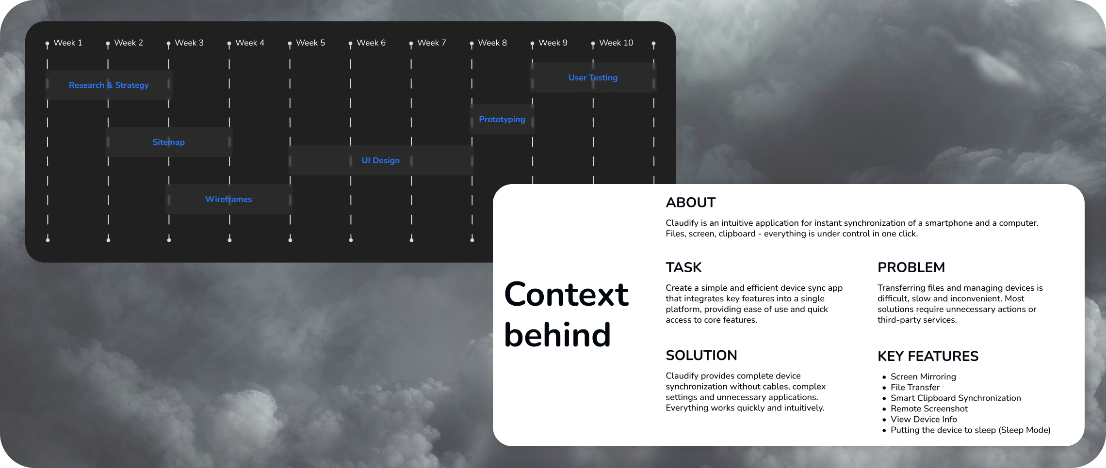
Claudify is a concept for a cross-platform device synchronization application designed to simplify everyday interaction between smartphones and computers. The project reimagines the experience of transferring files, mirroring screens, synchronizing clipboards, and managing connected devices through a clean, intuitive interface focused on speed and accessibility.
Problem
Existing synchronization applications provide powerful functionality but often overwhelm users with outdated interfaces, fragmented navigation, and unnecessarily complex workflows. Even simple actions such as transferring a file or sharing clipboard content require multiple interactions, making everyday tasks slower than they should be.
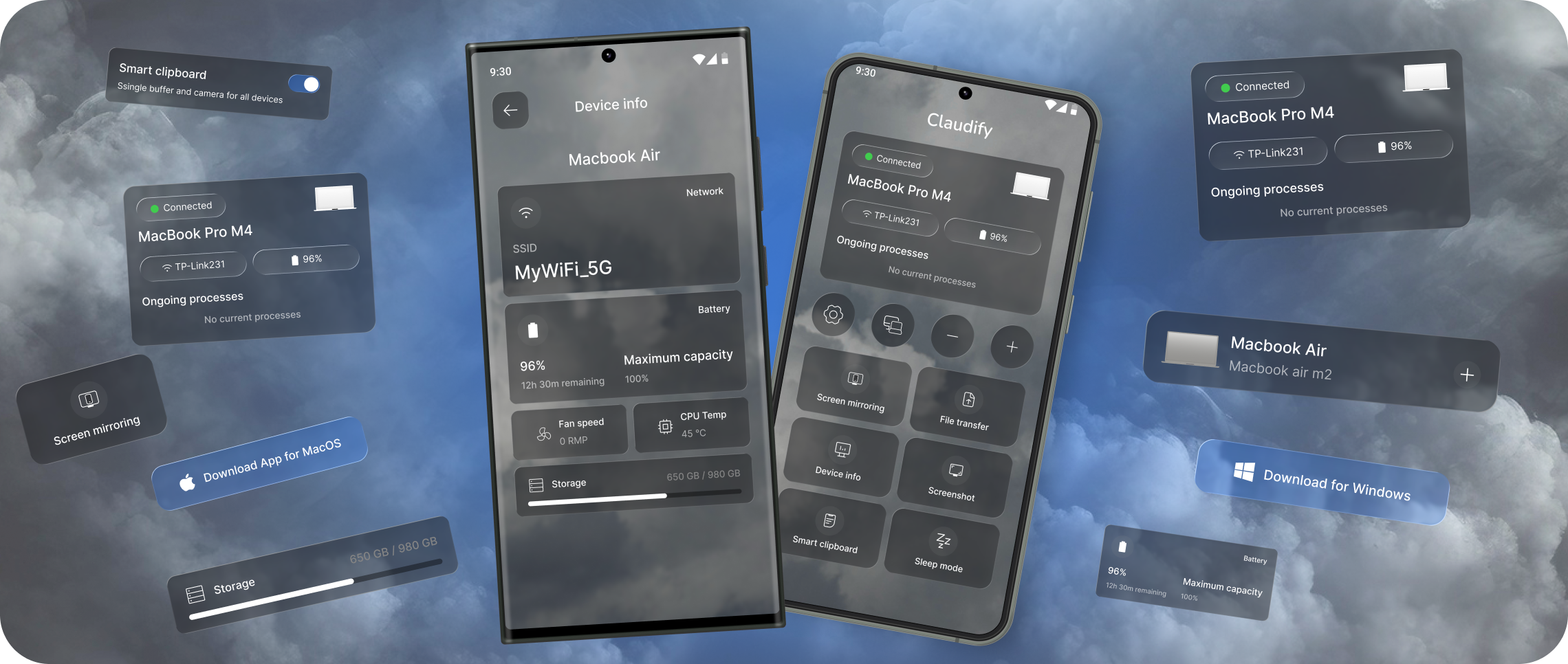
I redesigned a product I genuinely wanted to use
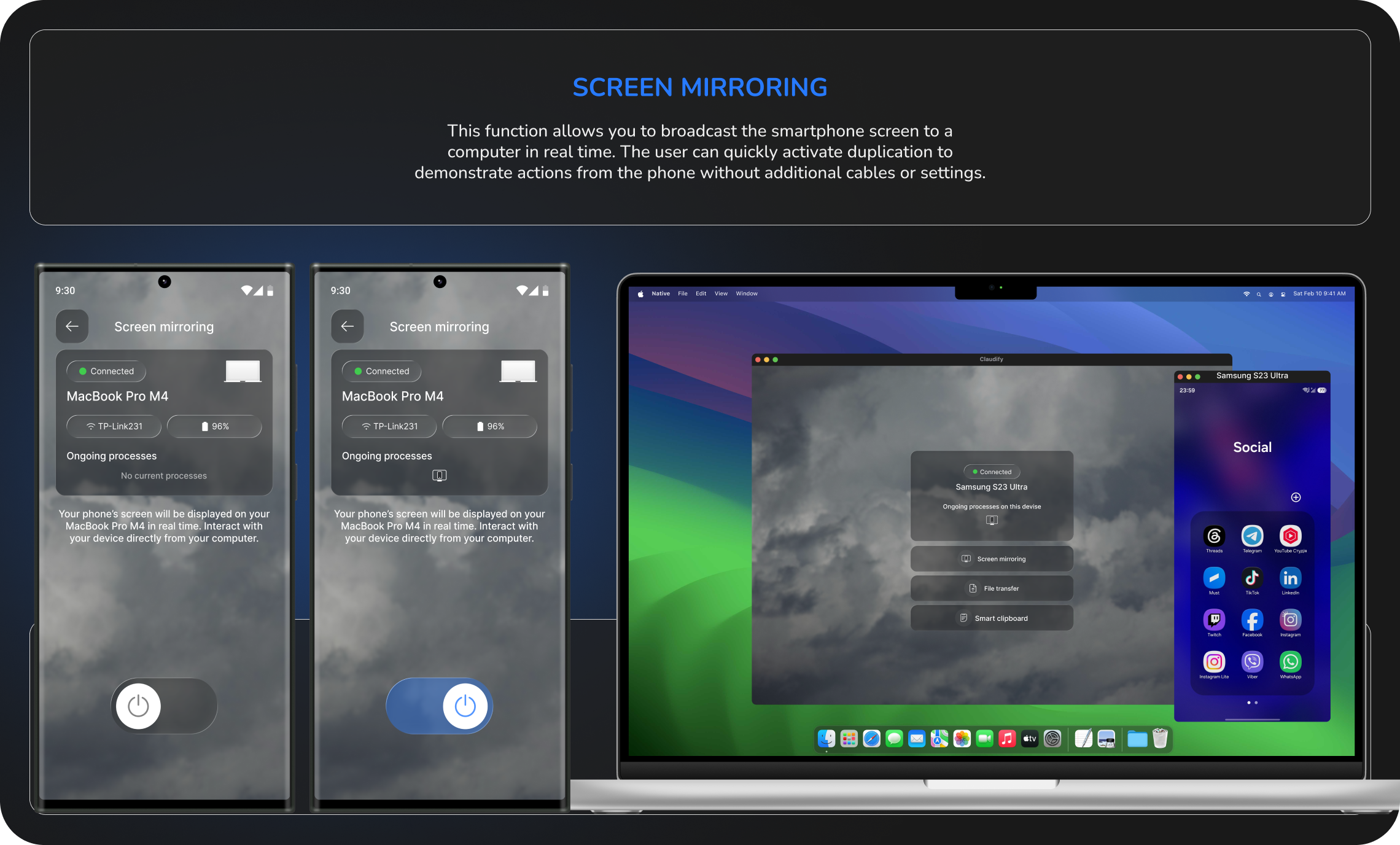
While working with my Samsung smartphone and MacBook, I relied on a third-party synchronization app every day. Although it offered the essential functionality, the overall experience felt unintuitive, visually outdated, and unnecessarily complicated. Simple tasks such as transferring files, mirroring the screen, or synchronizing clipboard required multiple steps and navigating through a cluttered interface. Rather than treating these issues as everyday inconveniences, I decided to redesign the product from the ground up. I reached out to the developers, shared my idea, and they were open to seeing a redesigned version of the application. That became the starting point for this project.
Reimagining device synchronization around simplicity
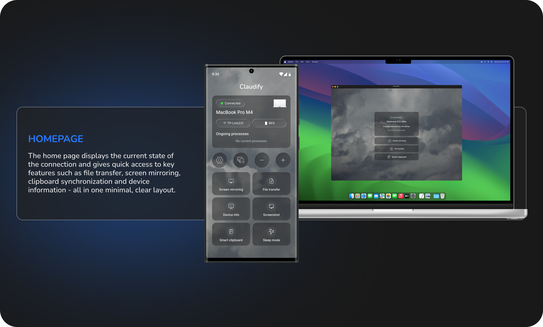
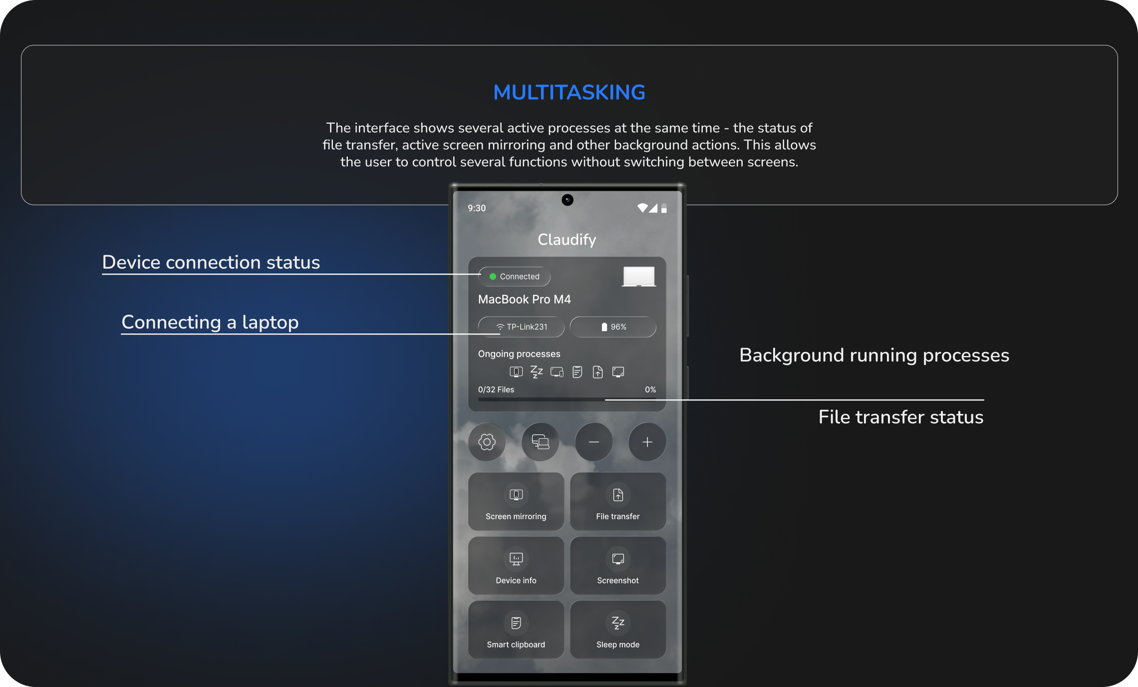
Instead of hiding essential functionality behind multiple screens and complex navigation, the redesigned experience brings the most important actions into a single, centralized workspace. Users can transfer files, mirror their screen, synchronize the clipboard, manage connected devices, and monitor device status without unnecessary steps or switching between multiple menus. By redesigning the information architecture and prioritizing real user workflows, the application becomes faster to navigate, easier to understand, and significantly more efficient for everyday use.
Understanding how people actually use synchronization apps
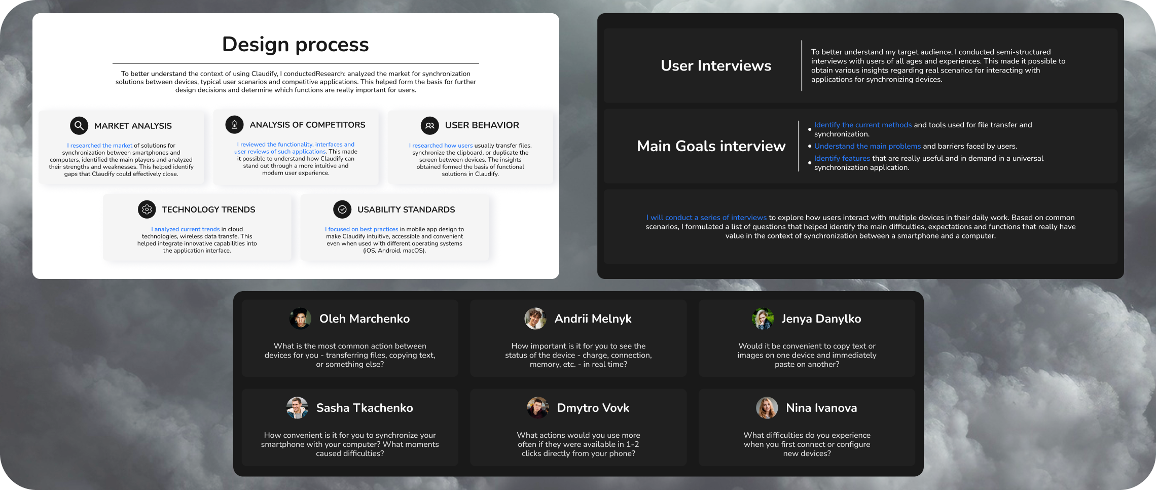
To better understand user needs, I conducted several research activities:
- Market Analysis
- Competitor Analysis
- User Behavior Research
- Technology Trends
- UX Best Practices
I interviewed users who regularly worked across multiple devices to understand their daily habits, frustrations, and expectations. The interviews focused on: transferring files; sharing clipboard content; screen mirroring; monitoring connected devices; onboarding and first-time setup.
One insight became immediately clear: Users think in tasks, not features. People don't ask for "clipboard synchronization." They ask: "I want to copy text on my laptop and instantly paste it on my phone."
Translating insights into product decisions
Based on the interviews, I created User Stories and Job Stories to prioritize functionality and define the core product experience. This helped transform user needs into clear design requirements before moving into interface design.
Research findings that shaped the product
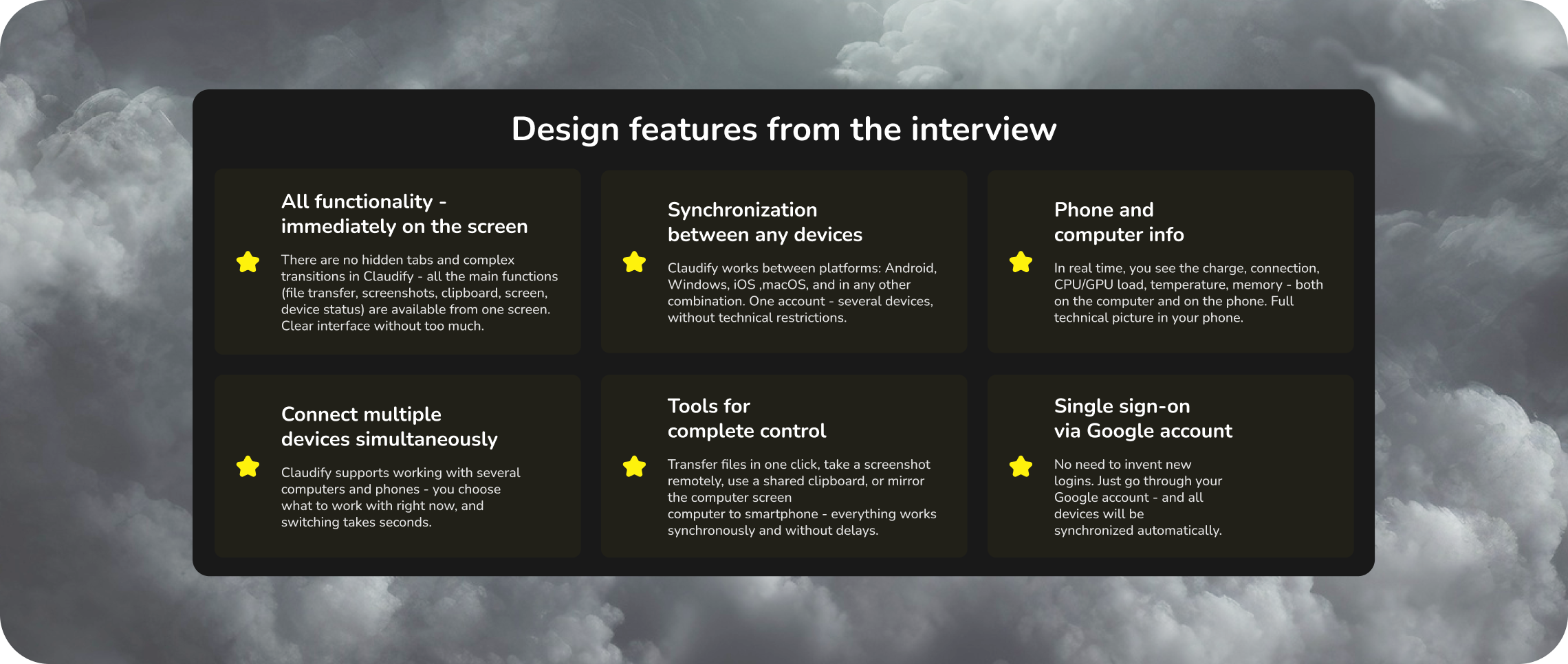
The research revealed several recurring patterns in user behavior that directly influenced the redesign:
- Speed over feature quantity: Users wanted to complete common tasks in the shortest possible time rather than navigate through numerous menus.
- Task-focused navigation: Users think in tasks, not features. Instead of searching for technical capabilities, users simply wanted to send a file, mirror a screen, or copy text between devices.
- Immediate visibility: Core functionality should be immediately visible. Frequently used actions should always be available from the main screen without additional menus.
- Real-time status: Real-time device status increases confidence. Users preferred to see connection status, battery level, and storage information before performing actions.
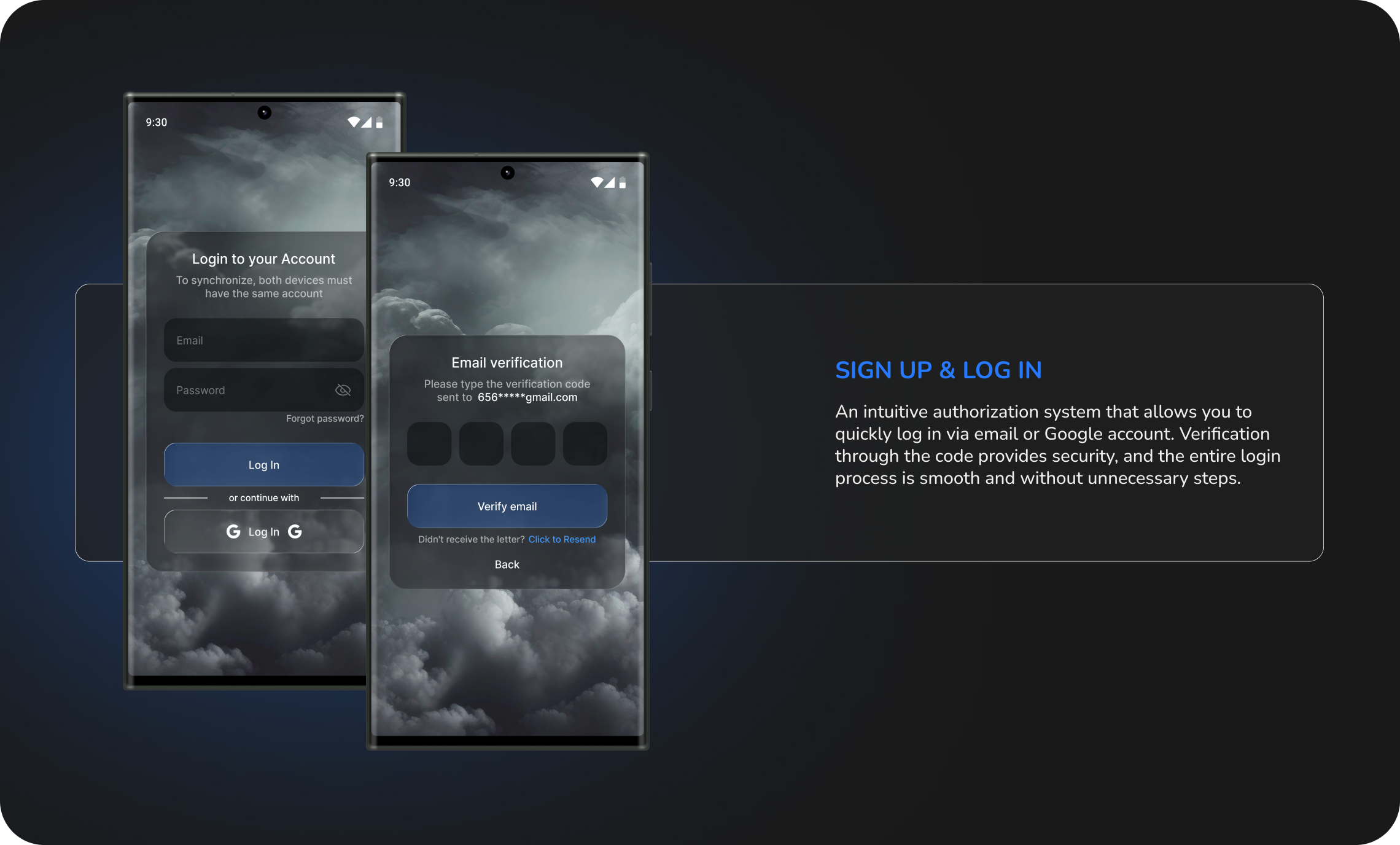
- Frictionless onboarding: Simple onboarding reduces friction. Connecting a new device should require minimal effort and no unnecessary configuration.
Turning research into product decisions
The research phase revealed several recurring usability issues that directly influenced the final product decisions. Users consistently expected immediate access to the actions they performed most often, which led to the creation of a centralized home dashboard where all primary functionality is available from a single screen.
Another recurring issue was fragmented navigation. Important features were scattered across multiple sections, making everyday interactions slower than necessary. To address this, I redesigned the information architecture, grouping related actions into a more logical and predictable structure.
One workspace for every connected device
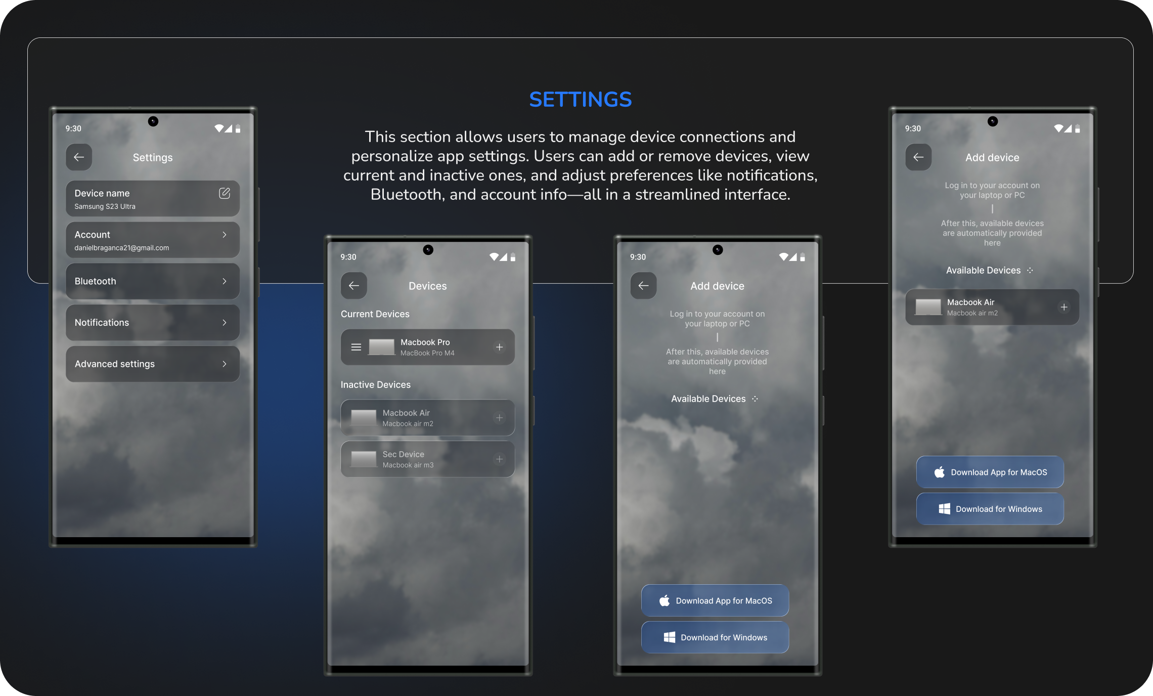
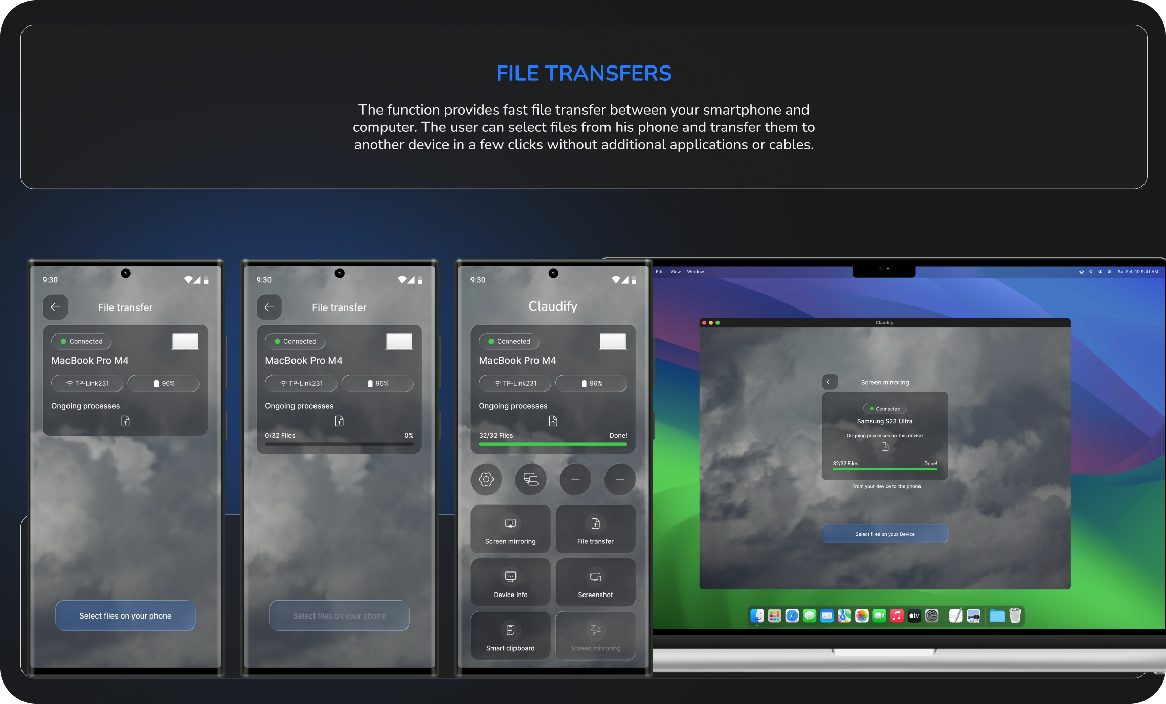
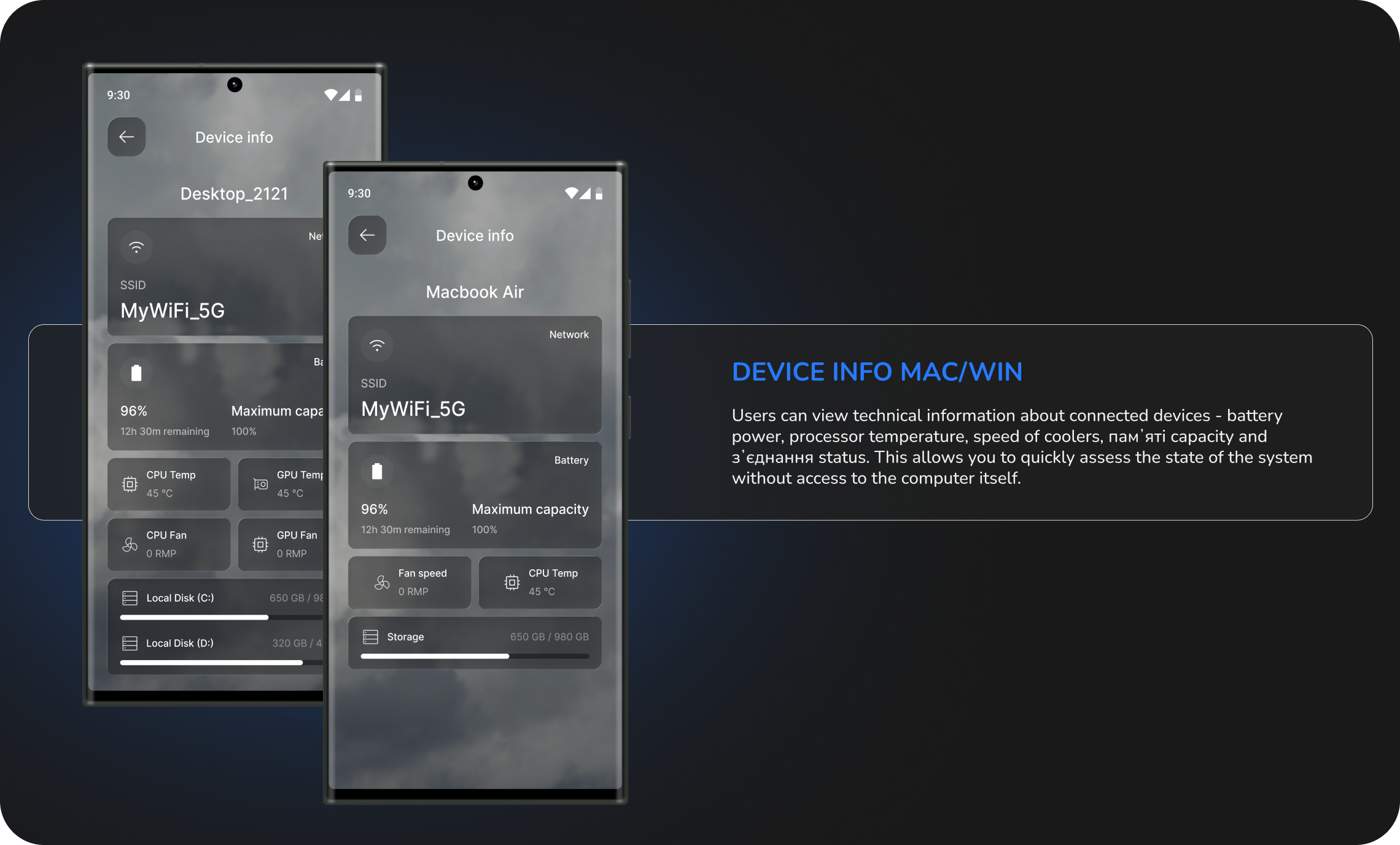
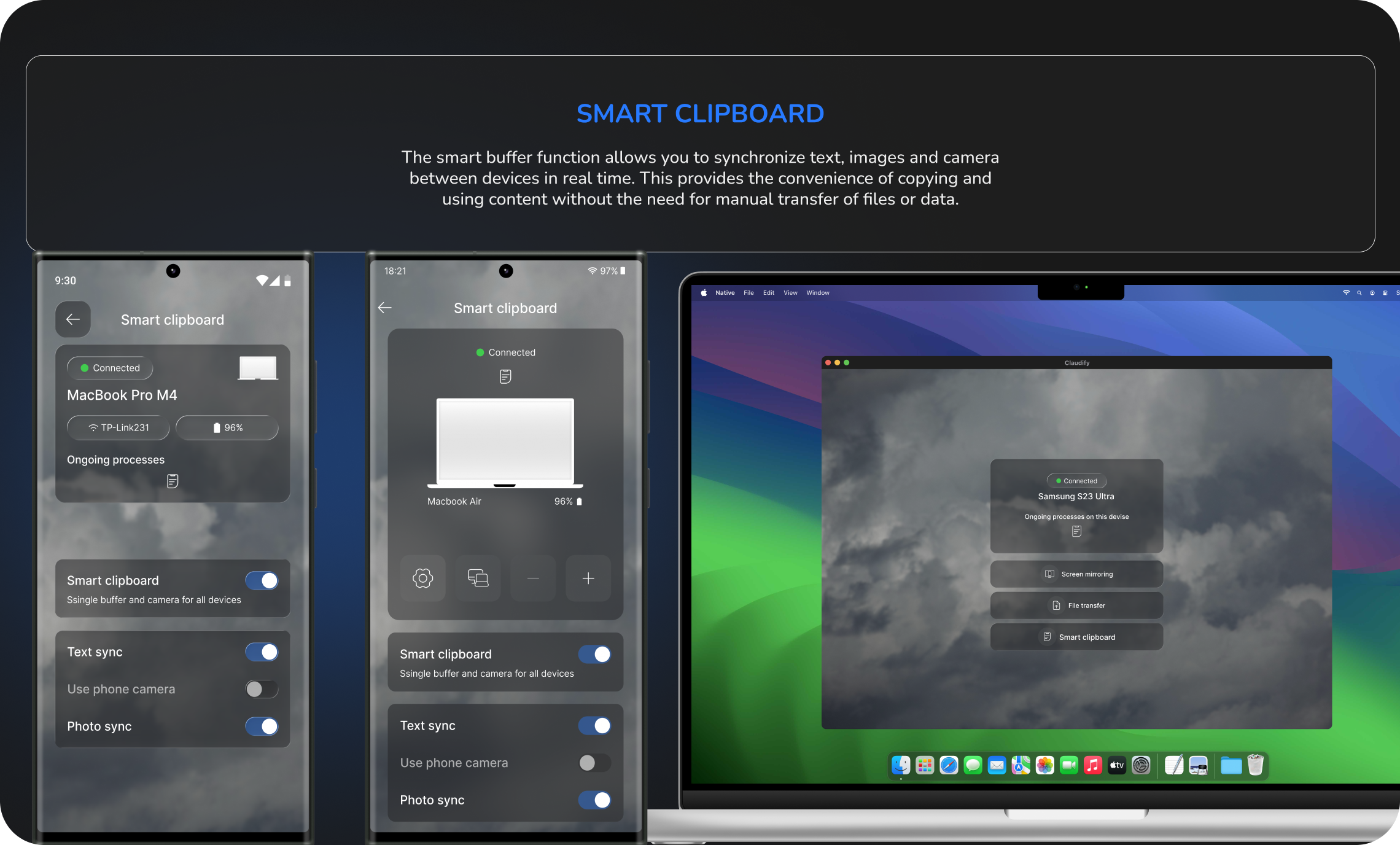
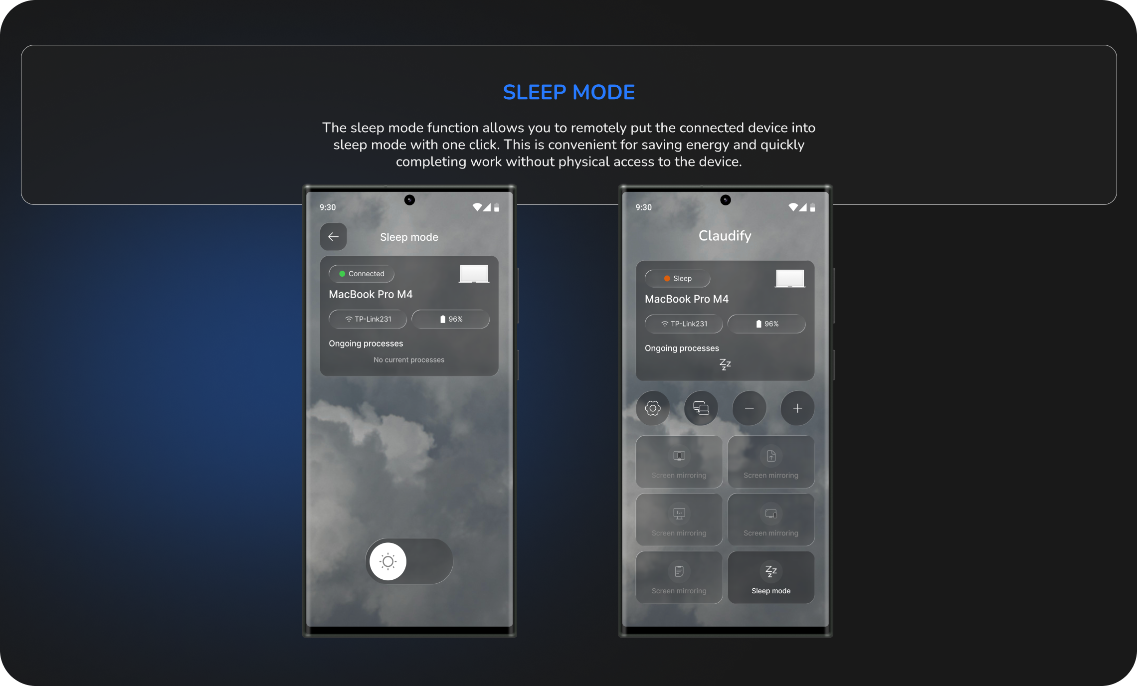
The redesigned application centralizes the most frequently used actions into a single workspace. Users can: transfer files; mirror screens; synchronize clipboard content; monitor device status; manage connected devices; remotely control their computer. The result is a cleaner, faster, and significantly more intuitive synchronization experience.
What I learned
This project demonstrated how product design extends beyond interface aesthetics. By combining user research, information architecture, and interaction design, I transformed a technically capable product into an experience built around real user workflows.